
Yesterday, we pulled aside a few systems in design and took a microscopic look into part of the design process. Today, we’ll pull apart those systems to look at the components inside.
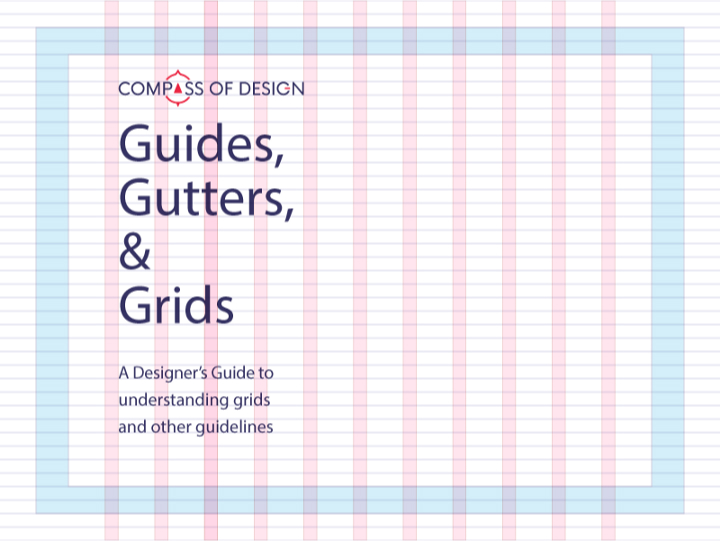
Our autopsy today is on Grid systems and the many parts inside.
Grids are one of the best systems you can use to guide people through content. To use them, you have to have a good understanding of lines and shapes and their usage in design (we’ll go over this in depth during the Designing with Confidence course). They take the content that you are designing for and helps you arrange things in logical order and logical divisions.
They are a product of using a few types of components.
Guides: The edge which you choose to align content with
Column: A vertical division of content
Row: A horizontal division of content
Margins: The area surrounding your content
Gutters: The margins between columns
Hang-line: A horizontal guide to align content to hang off of
Baseline: The horizontal guide for an element to sit on top of
Rhythm: Proportion systems that can help define the sizing frequency and spacing of each of the above elements.If you went to design school, you may have been exposed to (or overexposed to) some of these components during typography or a layout and composition class. However if you have been teaching yourself, you might realize this can be a very difficult thing to learn.
A good designer knows how to use a grid to guide users through content. An excellent designer knows when and where you can break the grid to create something truly unique. A good example of this is Jon Moore’s Off Center Alignment post. It’s such a dangerous trend to follow if you don’t have a purpose for it. Things that work for those with experience and a purpose don’t always work when you try to imitate it. We’re here to solidify our understanding of grid systems in design so we can be one step closer to breaking the grid with purpose.
Margins
Margins are important to all of your designs. They create an invisible frame around your content and allow visual breathing room. Your content can be just as claustrophobic as you are, so making sure there’s enough of a space between the edges of your medium and the content you’re filling it with is crucial.
Margins are usually specific to the type of device or print work you are doing. Print designers use margins as safe zones and web designers use them to anchor content properly on screen. To effectively choose what type of margin you are going to use, you need to know what content you are provided with and where that content will live. The proper proportions only echo that which medium you are designing for. Where print is a rigid size you can determine, most of the time digital designs are for sizes that are fluid and always changing, and so must your margins for your content. (size using percentages or ems/rems)
Typesetters would love this section because designing book layouts is something quite difficultand left to the detail oriented. Very subjectively, if you are looking for a general amount of margin that feels good, have between .25” — .5” (print) horizontal margins, or a 3% — 10% (web) margin on either side and variably a 5% — 15% margin on top and bottom. (both)
Columns & Gutters
Columns are a great way to segment content visually. They can group ideas together, they can break them apart, and they can balance out a document all using the content on the canvas. A single column works for simple documents and for delivering one consistent run of information. As the content becomes more complex, a multi column grid may become necessary to deliver content in a more flexible format.
Content can stretch multiple columns, creating its own hierarchy to supply main content and supplementary content. By diving things this way, you help people understand what content they should be paying attention to. You can also host different kinds of content divided by columns (like using the left most columns to hold images, and the right columns to host text.)
Columns can be further segmented by placing small gaps between them called “gutters.” These gutters are full of whitespace that, again, creates breathing room for your content. This helps divide your content without the need for placing a divider between them. (Think newspaper columns)
Web designers use column grids all the time to align content. Some of the more popular ones for use are the Bootstrap grid and 960 Grid. New ones pop up all the time trying to be the best, but knowing how to set up your own columns and margins creates this effect just the same. My favorite one for adobe programs is Guide-Guideto help set up grids using guides in Photoshop and Illustrator
I am a big fan of using 12 column grids with a 2% gutter width. This allows for a breathable grid to align content to. I might actually use this with print too. 12 is such a nice number because it splits nicely into 2, 3, 4, and 6 sections allowing more flexibility with layout.
Hanglines and Baselines
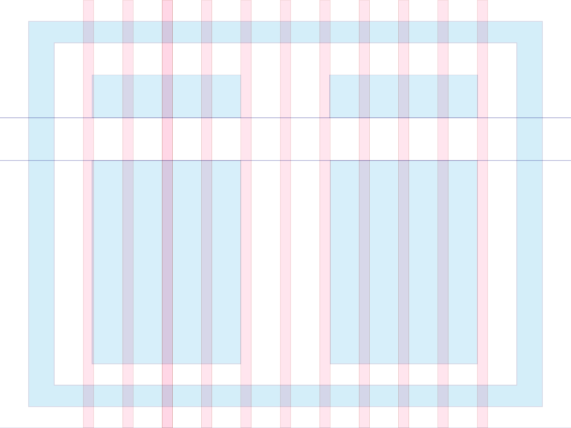
Hang lines and baselines are horizontal guides that give you an edge to align content to. They help create what is called a Modular Grid, where the content can be segmented into sections, “cards”, floating content, and more. These horizontal lines create a common anchor for content to help drive importance of main content and segment supplemental information. (like header and footer content)
Modular grids work best when there are equal horizontal and vertical divisions (like a square) to seat content inside of. We do this to keep the visual lines even. Sometimes content that sits outside of these lines creates a visual “Speed bump” that people can run into when trying to scan the content.
Baseline Grids

When you create a consistent set of horizontal baselines, you create a baseline grid. These are particularly useful when designing print compositions, but they can be equally useful when designing baseline grids for digital contenttoo.
Where modular grids align with the columns, a baseline grid will dictate the visual rhythm of the document. Invision is one of my favorite sites to get small design snacks like this (wonder if that term is trademarked)…
Anyways, the trick with setting a common baseline grid is using your base type for your text as a template for creating the baseline. Much like leading, you want the whole baseline grid margins to have between 1x — 2.5x the size of the base text. My favorite number to use is the Golden ratio, which equates to 1.618 times the base size. (It may be completely subjective to use, but we’ll go over that next week.)
Rhythm

Now that you have almost all the tools you need to create a grid, let’s talk about rhythm for a moment. Like all creative outlets, design needs to have rhythm to help satisfy the nagging feeling you get when things are unfinished or poorly designed. Rhythm is the patterned repetition of elements in space, a beat to set your visual spacing to.
Either consciously or unconsciously you set expectations for people who consume your design for when and where elements are going to appear. You create the column sizing to create a rhythm across the page and you create hanglines, baselines, or modules to create vertical rhythm that goes down the page.
As a dancer, there’s a set amount of space that they have to take up, they move to a consistent beat, they move through visual space. As a writer, you place particular sounds to punctuate a part of a pattern to pique a person’s interest. As a designer, it’s creating patterns and repeating elements to create a complete look to your design.
Your design will be judged as the entire thing, so if you’re great at aligning the small things on the inside, you’ll create a rhythm that people can follow and judge as a good rhythm.Like I had said in the last email, a grid system is a tool to be used in conjunction with the rest of your skills. It doesn’t automatically make you a good designer, but when you don’t use a grid, sometimes you can have tiny little mistakes that could have been avoided with using a grid.
The more practice you get using a grid system, the more you will be able to notice where things would stand out more if it broke the grid a little bit.
Go out there, make (and break) stuff. Have fun!
(Also say hi if you’re in the communityand let me know if this helped.)