Systems of Design: Part 2 — Scale
Following up from last weeks system, Grids, we’re opening another can of worms… Visual Hierarchy
Both scale and proportion have their place in visual hierarchy. If you didn’t set this up at the beginning of your work, how would you know what size to make something? If you’ve just been “eye-balling” your size, does something about it just seem “off” with the design?
Every part of your design is connected. By changing even a tiny thing, you can throw off the balance of the rest of the design elements. If you’ve ever heard of gestalt theory, design is something that is judged as a whole. These individual components will stick out like a sore thumb should something be off balance with the rest of your design elements.
Having a system in place for choosing your sizing scale will help you eliminate the guesswork and save you time in the long run. We’ll soon go over some simple patterns and ways you can test each one in a quick fashion.
This is a discipline of design that deals with setting visual and perceived differences between two elements. Once this contrast is established, a person will feel better about design and maybe even start to recognize patterns and conventions you’re using.
As a designer, when you discover how a system works, you start to realize it operated at a larger scale than you originally thought.
Though I joke, this article will go over some of the theory behind design scales. Prepare for some heavier thinking. So what is scale?
A scale is defined as…
Ok a scale, in my context of this article, is the measured incremental change from the current element to the next element in the series, often to be repeated infinitely or on a modular repetition. Maybe at some point we’ll talk about the weird words we call our design processes…
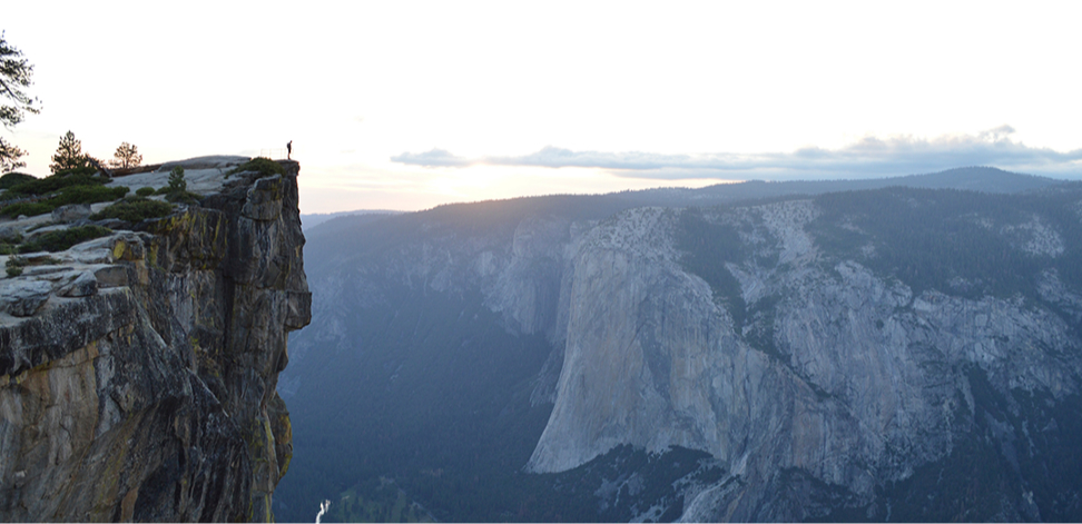
This form of comparison is no stranger to you though; we deal with these types of comparisons every day. We weigh the costs of buying the next largest coffee, we justify using a larger plate for our meals, we see mountains off in the distance and wonder why they move so slow while we are going 5 over the speed limit.
This is scale at its finest.
Ratio
Ratios are the direct comparison between objects. They can work for two different types of objects, like if I had a ratio of 2:1, I would have 2 strawberries to every 1 apple. 2 cups of water for every 1 cup of rice. Or they can work for comparing the same thing to itself. Where a sequence of things is 1:2 where “1, 2, 4, 8, 16” is where the current number is doubled to find the next number. This type of relation to each other can help us figure out the sequence and where it occurs.
Mathematics is important to what we do whether we consciously or unconsciously use it. Sometimes we need something to span 2 columns in our design and another to span over 4, we need to set font scales, we need to figure out what percentage of width something needs to be. At some point (nearly all points, but that’s with consciously setting them) you are going to need math to continue your work.
Ancient people like Leonardo da Vinci, Leonardo Pisano Bigollo, Pythagoras of Samos, Ludwig van Beethoven, Johan Sebastian Bach, and countless others shaped the way we see geometry, ratios, scales, patterns, and much more.
I’m going to talk briefly about one ratio. (I have rewritten this section twice already to avoid sounding like a mathematician and boring the heck out of you.)
This ratio is the Golden Ratio (that weird spirally thing we see all over the place.)
What is it and why is it here?
In the study of the universe (yes, the universe and all its inhabitants), we try to make meaning of the worlds around us by recognizing patterns, and forcing our own suggestions or conclusions on why things must be onto other people. If they agree on it, and enough people believe it, it becomes a new convention. The fibonacci sequence is said to be exactly that, called a confirmation bias.
So how did it start?
Leonardo Pisano Bigollo, or better known as Fibonacci had observed a problem in the population growth in rabbits. Finding to be that the population of rabbits that grows at an oddly specific rate.
This is as simple as I will explain but you can read about his story here
Other mathematicians have also observed this pattern throughout other forms of nature like plants, galaxies, human proportions, etc. This sequence which I will describe below is speculated to be found mainly due to confirmation bias. But the ratios are present nonetheless. There’s speculation that this ratio is considered the key to beautiful things. Though I would say, the things we have found to have the golden ratio as a part of it are very well thought out, we forget that if a thing that is done well is repeated over many instances becomes fact to us that it may be a good, beautiful, or tasty thing. Hence we believe this ratio to be a beautiful ratio.
This sequence is 1: 1.61803398875. or 1:1.618
And it can best be described by adding the two previous numbers to get the current number. 1 + 1 = 2 1 + 2 = 3 2 + 3 = 5 5 + 3 = 8 Etc.
This number repeated indefinitely creates a sequence where the relation of one number to the one before it is at a ratio of 1.618 times bigger. Thus for every number in the sequence we can fully increase it by multiplying by 1.61803398875
I’ll spare you the rest of the math, but that can be read about here and it can be visually described like this.
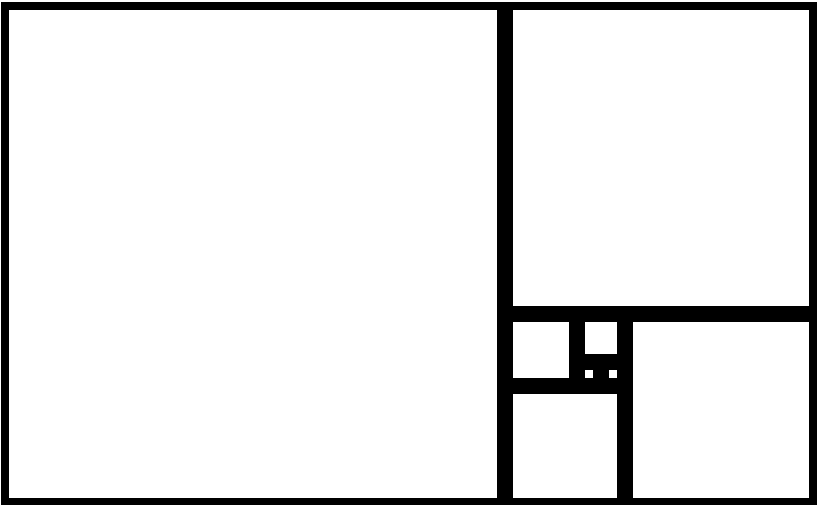
or
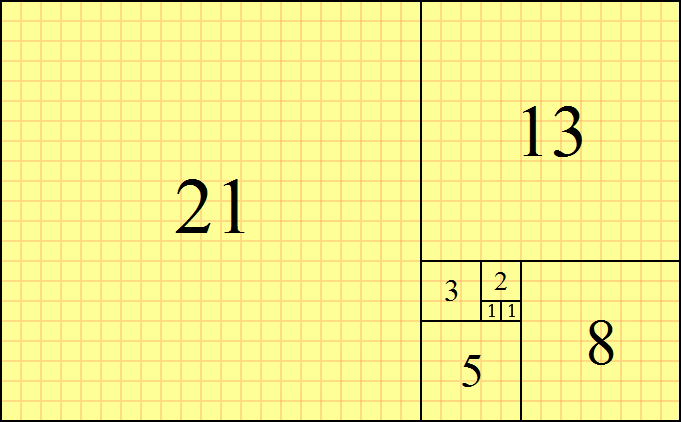
People are really crazy about using this all over the place in their work, and it creates a very good ratio for our next part. (but it’s not the only one.) Let’s see how other areas influence our topic of scale.
Scales
At heart, I am a musician. I breathe musically. If anyone has taken any music class as a child you’ve had to practice your scales.
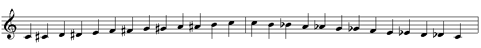
On a classical keyboard or piano, there are 12 notes before the cycle repeats itself. These 12 notes are used to create nearly all types of scales used in western music. The way a person uses these can change how a person feels the music to be happy, sad, creepy, cool, etc.
These notes are incremental changes in pitch in a continuing sequence that creates a pattern you can recognize and easily follow. A scale can be determined by the intervals they contain. We can see that in that Wiki link there, which I’ll reference here.
Octatonic (8 notes per octave): used in jazz and modern classical music
Heptatonic (7 notes per octave): the most common modern Western scale
Hexatonic (6 notes per octave): common in Western folk music
Pentatonic (5 notes per octave): the anhemitonic form (lacking semitones) is common in folk music, especially in oriental music; also known as the “black note” scale
Tetratonic (4 notes), tritonic (3 notes), and ditonic (2 notes): generally limited to prehistoric (“primitive”) music
Monotonic (1 note): limited use in liturgy, and for effect in modern art music
Music and typography have a lot in common. Sometimes a mild understanding of music is key to understanding it’s use in typography. Typography is one of the core concepts of design, and thus has the largest set of rules. It can be easy to just let your programs and tools define the way you use it, but what if we didn’t have access to those. How do you set typography to a scale with out having digital equipment to do so?
I’m going to drop this TED talk on using music for harmonious typography where he talks about the relations of musical scales and how they affect typography.
Another funny allusion to type is the way we use this sizing in measurements. If you’ve ever been asked to do a paper for school in 12pt font, it’s a standard for a reason. Points, picas, and other measurements were the early standards set due to mechanical limitations in the early days of the printing press. They used these measurements, much like in music, to set the size of type.
Think of like a note is to an octave, a point is to a pica. (ratios ftw)
Knowing and understanding this may take some time but lets see if we can break down any more details.
The typographic scale that we know (from Microsoft Word more than likely) follows as 6, 7, 8, 9, 10, 11, 12, 14, 16, 18, 21, 24, 28, 32, 36, 42, 48, 55, 60, 72, 84, 96 That link will show the use of this pattern and it’s origin, but I’ll summarize that the classic typography scale contains the numbers 6, 12, 24, 48, and 96. Thus the author there relates that numerical scale set to two times the previous number with 5 steps in between. This is what’s called a modular scale.
A modular scale is a sequence of numbers that relate to one another in a meaningful way. Much like the modular grid in our last email, it’s a pattern that repeats using the same amount of space to represent a segment. Using the golden ratio, for example, we can produce values for a modular scale by multiplying by 1.618 to arrive at the next highest number, or dividing by 1.618 to arrive at the next number down. Best explained here in this List Apart article,we start this ratio by figuring out which typeface we would like to use. Figure out at which size it looks best in regular paragraph settings, and create our scale with that font size as the base. We can then use this calculation for the rest of our design.

Proportion
Proportion is all about context. One of my favorite people to read about proportions is Leonardo da Vinci. Like me, he is fascinated by some of the weird coincidences of nature and the blending of both mathematics and art. If I loved proportions and weird coincidences, it was basically this guy’s job. Looking up the Vitruvian Man, it was a piece heavily studied, tested and theorized by Leonardo in his quest to understanding stuff better (trust me I’m a scientist… as in I’ve watched a lot of science related shows).
Proportions are the relations of many pieces to many pieces. Think of looking at the human body and noticing someone’s eyes are too small for their face, or that their legs are too short and their arms are too long. We want to avoid this in our own designs and understand the relation of one thing to the other.
This works with our designs by understanding the size of a picture in relation to the amount of text on the screen. We want things to feel balanced and whole. Therefore proportions tell us if our sizing is in harmony or if there are parts that are broken or off key.
This is something that can be done mathematically, but at this point we’ll leave it up to you to decide whether an item can be too large, or disproportionate to the other items around it.
When you change one item, you might have to look again at the whole thing to evaluate if what you changed changes the balance of the rest of things on the page.
Ok what the heck am I supposed to do with all this information?
Boy that was a lot of information. What the heck am I supposed to do with it?
Maybe more than half of you tuned out. This proved to be a more challenging piece for me to write, and there was more that I just left it to the people who explain it rather than try to give my best. (which was still a lot). There are some really great resources up there to understand proportions, ratios, scales, etc.
Let’s break down what we know.
Ratios set the increments that we use in our scales. Ratios can be pulled from the Golden Ratio (1:1.618), from music (The Ted Talk here), or you can create your own to increase your increments by.
We set up the scale to focus on what sizes certain elements will be. It helps bring repetition, logical increments, and a baseline to start with.
Once we have that scale set (either modular or dual stranded modular, diatonic, or whatever you choose), you have to find the base element to use as scale.
Proportion is that base. Think of homes being built around the average size of humans. If your house was built for the relative size of a child, it would be a scale model to what would feel right to your child, but would be out of proportion to you. If they changed the height of the doors to accommodate, you would have doors that fit, but break the scale and thus the doors are now disproportionate to the rest of the house.
When you change one element, evaluate if the rest of the elements need to change (as in changing your scale).
All together, this can become a lengthy process to figure out. But as you put this system into practice, you’ll have verified examples of what works and which didn’t. You then have a good base to start your design off from.
There are tools people have used or created that achieve this. For typography, you can use:
http://type-scale.com (typography scales that will work for most your designs)
http://modularscale.com (modular scale creator for sizing all sorts of things
http://grid.guide/ Measurements on grids where you can play around with sizing.
http://guideguide.me/ for photoshop and illustrator.
Why didn’t I give you these in the beginning? I’m a big believer that if you can learn to do something without the use of training wheels, you’re going to be able to make better work.
Until next week. (and I promise next week’s will be lighter.)
— Darian Rosebrook, Brand Identity Designer

Struggling to get traction in your design career?
You are not alone, every week we go over ways to market yourself better as a designer by improving your design skills, your personal brand, and other design topics.
We’re building a community for the designers like you.
The Compass of Design Community is a growing place of positive and driven designers who are working at being masters of their craft. Whether they’ve been designing for years or are just getting started on their journey, you will find this a place where you can get the critical feedback on your work and connect with like-minded designers.
Check out the Compass of Design to get weekly design tips and access to the design community (: