How do you design a product that looks and feels consistent?
How can our role in design create a common language that is used throughout any department? What you see above is another micro part of the design process. It is both jam packed with other design principles and part of a bigger picture. We’ve been talking about systems for a few weeks and today we are wrapping the series up with my favorite system. The design system.
Much like a codex or Pokédex for your brand, a design system holds all the information on how you create products, sites, marketing material, etc for the brand. It is something that I am trying to specialize in as a designer because this type of system is heavily practiced in Branding Design.
The world of branding makes up more than just visual design, it goes into messaging, audience reach, idealism, and marketing / advertising. It builds upon the goals and voice that a brand would like to achieve and it crafts the experience a person would have interacting with it. The best book I have found so far on it is the book “Branding in five and a half steps” and covers the gap between idea to execution. This book and The Brand Gap have helped shape my view on creating a design system or codex for your brand.
Do you need a codex for your design?
Large companies have enough brand recognition that their products are completely recognizable even outside of it’s packaging or context. That is why you can spot a Starbucks cup from far away, you know in a split second BBC news is on, and that every bottled soda is either a Pepsi or CocaCola Brand. It’s taking a product and brandwashing it so it can be recognized by anyone who’s ever seen that company before. Do you need it for your design? Probably. If you are creating designs that span multiple products, multiple campaigns, multiple websites, or rebranding a whole identity. Having a common language or a lexicon to pull from helps keep everything “on brand” across departments.
One off designs can still benefit from having a small system set aside to pull ideas from, but you might not need to build a 42 page lookbook for your design. The larger the scope of the company, the more effort you need to put into creating a unified style. Even you and your personal brand can benefit from this type of work. So…
What do you need to start one?
It all starts with content, intended audience, and goals.
After meeting with a client or coming up with a new product idea, you should have some ideas of what goals and audience you want to reach. You would then have an idea of where it would sit in the market and demographics you are trying to get into. You can then choose what kind of voice and message you want to convey. You then start to explore it visually. This type of exploration needs those steps beforehand otherwise you are creating based off of assumptions and will miss the brand’s focal message.
When finding words to describe the brand, it is important to choose words that are flexible enough in their definition that they can specifically pertain to your work. Once you get words that will be used to describe the brand, you can dial up or down their importance in your brand.
So if you were to set a list of words like:
Connected
Sporty
Pristine
Energetic
Powerful
Intelligent
Each one of these would get their own level on a scale. Then you can start to dial up or down from 1 — 5 (1 — 10, 2 — 87, 1 — ∞). It’s a subjective scale that just lends perspective about what is most important to the brand. So when you look at the scales you’re setting these as importance to the brand, you have an idea of where your design might sit.
Let’s break down what a full set of these systems are and how they can be useful to your process.
At some point in your design career you might have had to pull together a board of images and words to get a feel of what you or your client would like to have your design look and sound like. They might focus on a few words or base their needs off of the goals they would like to achieve. It takes a little bit of time to digest that and work on how to express that visually.
By puling together these materials, you start to understand what mood you want to set. This can come directly from working with the client to understand their goals and audience, or it can be based on research you do about their industry. You want to capture a lot of inspiration on this board so that when you go to design, you aren’t outright copying one design. You can use sites like https://pinterest.com or https://dribbble.com to build your visual moodboard or take pictures from the internet or your camera to have something to present.
This document serves as a springboard to creating a one off design that won’t necessarily be repeated across several applications. There are more useful systems other than this to get it done. You create these as low detailed examples of where the design should fall into. They are just a step to start creating more detailed, content filled designs.
You can pull in photography, illustrations, icons, shapes, colors and things that convey how you want the brand to look and feel. Just make sure you are matching the goals of the project.
When you start coming up with projects that span multiple mediums and products, there are elements that will have to be designed the same way or similarly to keep within the visual guidelines. In web design, these are higher detailed mockups (an example of the content being used in a design), and in product design, it’s using similar materials and elements to keep the theme going. Think of it like building a modern / futuristic looking house and someone wants to bring in a Victorian era bathtub. You’d have to gauge it against the visual guidelines to figure out if it belongs.
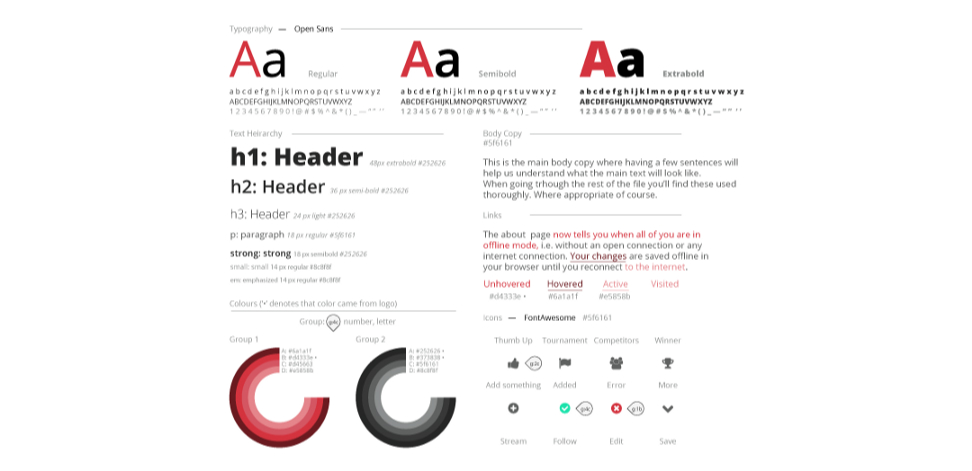
When designing for a visual guideline, you want to make sure that the content you have can be gauged against the specific dimensions of the end product. Using guides, grids, proportion systems from our last 2 stories (one and two) could prove very useful here. It would lay out everything like in the title image. You would outline how typography is to be used, if your images have rounded corners, and what colors you are using. When deciding on what to size something, going back to this document should have specifics on how to make certain design elements, what color to use, what dimensions. etc.
The youtube channel The Futur has a really good talk on how to do thisvisually with what they call Stylescapes. They build upon this topic in a great detail in trying to do exactly what we’re trying to achieve. A visual guideline based on the goals and audience of the client.

After all is said and done, you end up with a good brand filter to run new ideas and products through. It is something that serves as a holistic view of the entire brand. Even though you have individually design pieces, each piece is a part of the whole, and will be seen as a whole brand. As you build things for the brand, over time you might realize a need to have it look like the rest of what you create.
Taking the last two stages of this, you can create what is called a design system. This is an overarching document that spans multiple departments and categories of the product process to ensure everything you have is part of the whole image. Creating this design system will take some time. It contains all of our goals, choices in content, visual decisions, dimensions / proportions / ratios, audience demographics, and bases of our skillsets, combining it all in one document. This document helps you shape the experiences someone has in part or in whole when interacting with the brand.
Large design agencies and advertising firms specialize in crafting these. Some might see it as a way to brandwash certain products and materials, but it helps solidify the product as part of the overall quality of the brand.
One of the best examples I have of this is Dropbox and their brand guidelines. (Part 1, Part 2)
It is a very long read, but well worth it to understand it’s full use in terms of design, messaging, and audience. Really, designing the experience is something that goes much further than what we do as visual designers. But why should we care?
Because what separates us from the larger and more successful designers is their ability to recognize these elements and set up the unique identity to design through. We as designers help visualize the filter in the process and give life to what might just be the next everlasting brand.
Have you had the time to do a visual audit with your project? Can you truly say the product and all it’s elements are related?
Take some time and set some guidelines for your design.

Struggling to get traction in your design career?
You are not alone, every week we go over ways to market yourself better as a designer by improving your design skills, your personal brand, and other design topics.
We’re building a community for the designers like you.
The Compass of Design Community is a growing place of positive and driven designers who are working at being masters of their craft. Whether they’ve been designing for years or are just getting started on their journey, you will find this a place where you can get the critical feedback on your work and connect with like-minded designers.
Check out the Compass of Design to get weekly design tips and access to the design community (: