It’s a sticky place to be when you only have a few hours to get some design work done. You might have been procrastinating or busy with other parts of your process. Either way, you’re running short on time and you haven’t even started on the design.
You then spend the first hour and a half getting your color palettes picked, your grid lines set up, grabbing fonts, figuring out your typography scale… the list of things to do is endless.
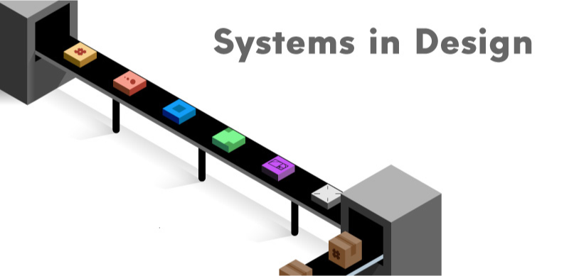
Having systems in place to use during your design process is one of the best ways to combat this endless battle of time. Steps in the design process that can take a huge chunk of the clock to finish can be reduced to a fraction of the time with a good system in place.
However, just like forming new habits, it’ll take a bit of practice to make sure that you have these systems in place before you get started on any work. And with these systems, they can work for you or against you. They become ingrained in your process through unconscious absorption or by your own conscious effort.
As long as you are working on putting effort in to adopting the system in your process, you can start creating work that not only looks consistent, but more thought out and feels natural to the intended viewer.
Over the next few weeks, we’ll be pulling apart Layout and Composition, Visual Hierarchy, and Design Systems,(all very large topics) to look at some of the components inside.
Those on the Compass of Design newsletter have have seen these topics in depth, but for those of you here, it’s a preview into the types of content we go over.
Every working system has separate parts driving the machine. Systematizing these parts of your design process not only speeds up your designs but creates a more unified and effective solution to whatever problems you are trying to solve.
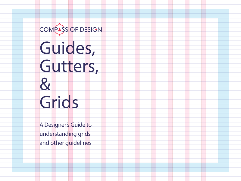
Grids
Grids and guides are used in everything: icon design, print layouts, typography, hand lettering, web design, photography. A well defined grid system can set up anchors in your information and guide people through the ideas and concepts.
Whether it is your guides set up in Adobe Illustrator (using “Guide Guide” of course) or using grid lined graph paper, having one in place will help create more appealing content that engages people. Information that is consistently laid out is easier to consume and take action upon. It’s true that just knowing what a grid is won’t make you a good designer, but those who can use a grid effectively will create astonishing designs, but they also know when it’s okay to break the grid to make something truly unique.
Grids are one of the best systems you can use to guide people through content. To use them, you have to have a good understanding of lines and shapes and their usage in design (we’ll go over this in depth during the Designing with Confidence course). They take the content that you are designing for and helps you arrange things in logical order and logical divisions.
Sizing and Proportion
Both size and proportion have their place in visual hierarchy. How do you know if something is sized properly? Does something feel off in your work?
Properly setting up a logical scale will help provide context to your work.
Every part of your design is connected. By changing even a tiny thing, you can throw off the balance of the rest of the design. Design is something that is judged as a whole, but these individual components will stick out like a sore thumb should something be off balance with the rest of your design elements.
Having a system in place for choosing your sizing scale will help you eliminate the guesswork and save you time in the long run. We’ll soon go over some simple patterns and ways you can test each one in a quick fashion.
Visual Guidelines
A “design system” sets everything up when you hand off your design to others who are working on the same project. By having visual guidelines in place, you are capable of keeping your design for the project intact after the hand-off.
Visuals are an important part of design, obviously. But without a system in place to filter new ideas through, your next design might just end up “off brand” and disconnected from the rest of the work.
A “design system” is based on viewing the collection of individually designed pieces as a whole. People will perceive a whole design system before they learn to read into the different parts that make up the whole thing. You have direct control on what that experience will be. Soon, we’ll talk about visual guidelines and how to set that holistic guideline correctly the first time.
We can sometimes feel that working on these elements are super labor intensive. However, I have found that by practicing each of these disciplines by setting up templates and using proven methods, you can help your design reach the final result much faster.
This is especially true if you have go to systems that are defined at the start of your projects (before even moving the pen or mouse). It is a very nice feeling knowing that when you have all the information from the project brief, research, or brand audits, you can eliminate the guess work and get straight to the actual design.