We talked about color in our latest Design Principle Guide, and the guide was was a good look into color theory. The application of color, however, is another beast.
Since this isn’t one of the main principles of design, but an extension, think of this guide as the next steps to take after the principle of color theory.
Applying color to your designs does take an understanding of how these colors are selected and what color process we’re using to achieve it, so if you haven’t seen it, definitely check out the guide.
The psychology behind colors is subjective and changes from culture to culture. Therefore, I’m going to avoid playing on the psychology of color choice, and that specific colors drive different emotions or should be kept away from.
You’d be surprised to hear that designers try justifying these colors based on how a general public may react to these without thoroughly researching the brand and it’s audience’s preferences in their ecosystem.
The thing about color is, the effectiveness of color palettes are contextual to both the brand and ITS audience. So you’re going to be working with two things when choosing your colors for your UI design projects.
Accessibility standards and Brand colors
For anyone who’s gone through a client project for an established company with existing brand assets, you might have learned that you don’t get to change colors, logos, or names without being asked to do so.
These brands have colors that exist and should be used to tie in the site to the thing that the brand is about.
Before starting any UI project, make sure you check with the company to check for an established brand guideline for color. Though you still can change things, this will give you a decent baseline of where to start.
Maybe it means you keep one of the colors and start introducing new colors based on establishing the feeling that you’re going to portray to satisfy the brand’s goals.
First, you got to make sure they’re accessible color choices.
Web Accessibility Standards
Along with color being subjective, there are tons of accessibility issues to work with when choosing colors on a whim.
With web accessibility, there are more than just people who have impaired or blurry vision.
Contrast
Keeping decent contrast between colors is going to help keep your design accessible to people who have difficulty seeing in general.
Colors that are too close in luminosity, hue, or saturation can be difficult to distinguish when paired next to or on top of similar elements. This difficulty with distinguishing elements can happen even when a person’s vision is unaffected.
The New Code has a great list of standards to look at for keeping the contrast of color in check. But for a short-rule, keep the contrast in check by testing out your colors by converting the palette or design into grey-scale as a quick way to test the amount of difference.
Colorblindness
If you’re wondering how else a person’s vision may be affected, consider the fact that some people run their daily lives with color-blindness.
There are plenty of people who have learned to live their lives and figured out how to maneuver many things that aren’t sensitive to color-blindness.
I myself have a near impossible time distinguishing colors apart from the red-yellow-orange spectrum. Unless a color is at either extreme, I won’t be able to tell the difference between a slightly red/orange or orange/yellow, a yellow vs orange or red vs orange. (it made designing a previous logo so hard that I had to do the whole thing in greyscale first and then systematically bring in color in hopes that it worked. It did, and thankfully I recognized a way to get past that hurdle.)
Another great resource to check is The New Code’s color-blindness reading list for some tools to use to check for color issues.
So if you’re not sure that your color palette passes the accessibility test, I want you to check your color contrast before committing the pallet for use
Brand Standards
If you’ve started a brand new project from scratch, congrats!
Not a lot of people get to define or rebrand color palettes, and you have the ability now to get a great foundation going for the brand. We’re going to look at both perspectives, established brand or not, and determine how we should be selecting the five sections of color groups.
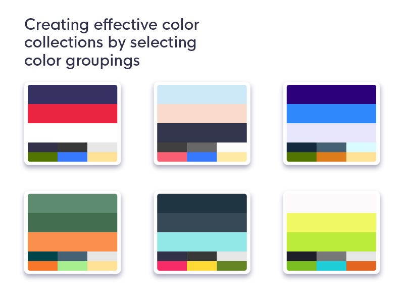
Group 1: Main, Secondary, Tertiary
Usually based off of brand colors, a brand may have three or more prominent colors in its design. Very rarely is the brand using less, but somewhere in the process of defining your UI color scheme, there needs to be no more than three color choices for the first group.
These three colors will be your Main Color, your Secondary Color, and Tertiary (Third) Color. They will be driving the main styling of the app, website, or widget you’re creating.
The main color might as well be determined as the brand’s main color, with the secondary and tertiary colors defined from the second and third most prominent colors for the brand. These will be used to bring the most attention to elements and used as a tie-in to the current brand.
The first color palette you see in the top left of the image above is what we currently use for Compass of Design. Our blue, red, and white are the three main colors of the brand.
This is followed by our light and dark values, interactive color, and denotive colors at the bottom.
If there are more than three prominent colors, pick the two or three that work the best for the UI based on the types of color pairings in our Design Principle: Color guide. If there are currently no colors for the brand and this is our first place to define it, try to come up with a palette of colors that uses some of the great color pairings from the color design principle guide, or start finding a color type that you feel comfortable that has enough contrast or color elements to be able to make a bunch of different elements out of it.
You can use resources like colorhunt.co or palleton.com to come up with some color palettes too, but remember to find stuff for the other groups below.
Group 2: Denotive colors
These colors indicate common actions that inform a person what the app they are using is doing. Think of alerting the person, deleting a post, creating a new post, liking or hearting an action.
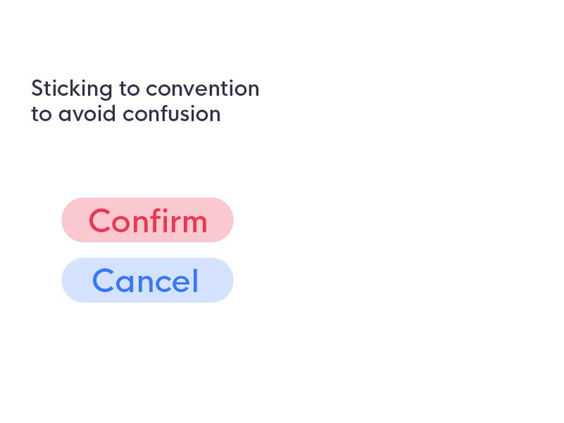
It’s best not to go against convention when it comes to picking colors, or you can risk people accidentally taking the wrongly intended action by mistake.
We don’t use red as confirmation buttons next to an action that cancels a post. And we don’t create a destructive button that’s fun to click. Seriously, I’ve clicked a lot of buttons in real life I wasn’t supposed to because of the satisfaction from how the button reacts while clicked.
Denotive colors are to be intended for a base of Creating, Deleting, and Alerting a person that something has happened, will happen, or is in process.
Group 3: Interactive color
Interaction design sometimes falls under the duties of a UX designer. Though there are companies that value the insights of specialists here, specialists sometimes are not available. Therefore, it’s good to have a singular or common interactive color that let’s someone know that a button or certain element is available to interact with.
These colors might be from your main group, your denotive color group, or any other grouping you may have created. Just make sure this color is chosen to remain consistent and untouched for the remainder of the design.
It may also be smart to talk about creating tints for this action to be denotive of the current state of the element. (Untouched, hovered, tapped, loading, errored, succeeded, disabled, visited, etc)
These values are known as Shades and Tints
Group 4: Dark and Light Values
One thing will be for certain, you will need to determine how you would like to display your lightest colors, and how you would want to display your darkest colors.
Using straight black and straight white can be harsh on a person’s eyes, but having no idea on what to choose in place could be just as bad if you don’t understand the harmony of colors.
Sometimes it’s best to go fully desaturated greys for a dark color, like #333333, or a desaturated light color like #FAFAFA
These colors can look really dull next to a vibrant color palette however, so instead of having an extremely dull dark color, you could put some saturation of color into it like #323149 or bump up the saturation of the light color like so #F0FFF0
These, though not strictly black or white, can be referred to as your dark and lightUI colors. They work great for backgrounds and text colors.
Group 5: Shades and Tints
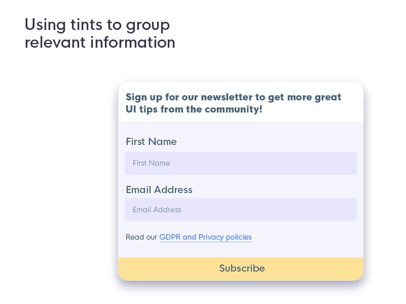
More than likely, you will need to add variations to your color palette to indicate actions, history, or current states of elements in your design.
You can use these colors to help boost the hierarchy of your design.
By grouping colors based on tints, you save a lot of the need for hard visual separators (something we’ll talk about in Design Principle 6).
By allowing your design to use color in a visually divisive way, you’re creating just a slight bit more work for you, but it’s work that will save you from making some hard decisions when it comes to how to separate or group the element on the page.
Tint
A tint of a color is determined by adding white back into the color. Tinting your color serves as a way to achieve analogous color palettes where the color lines up with variations of it’s own.
Shade
Shade is determined by adding a darker color to decrease the brightness of the original color. It’s quite literally what you would see in the shade of a particular color. I’ve learned a lot from Erik D Kennedy’s A Color Framework post on Medium.
It takes a little bit of practice, but there’s some things to keep in mind when creating these color palettes.
What I’ve learned from my friend Kyle Adams in his course is that if you increase the brightness or light values, it’s best for you to decrease saturation, or you’ll be fighting the attention for your main interactive color. If you’re picking out a shade for your color palette, remember to avoid your color becoming muddy or yellowish in tint by increasing the color’s saturation.
Using Colors in Your UI
After finally gathering your color palettes based on how you wanted to keep everything organized. It may be time to start deciding how to use these colors.
There are plenty of ways to do so, which will be outlined in our 7th design principle. But to get to our point, you want to create contrast between items to help draw attention to the actions you want people to take with your design.
Take into account the heavy nature of elements that are full saturation
Some color choices create heavy, heavy visual focal spots in your UI. By understanding weight a little bit more, we get to understand the pull that certain elements have can be influenced by size and color.
Colors with higher saturations or darker values have been a big pull for the attention of other people. Seeing something bright red move across your screen might stick out more than a dark grey, or even lighter grey item.
When taking in consideration how color helps us determine what is important, we must also understand that not everything should receive the same level of attention. By using complimentary colors (variations of the colors you’re using based on the fifth color grouping, tints and shades), you’ll have created enough colors to get you through several use cases of you’re app or brand’s guidelines.
A complimentary color is only used in conjunction with the base color it’s derived from. Otherwise, it’ll be seen as another part of the mental overload that happens when someone’s given too many things to keep track of.
A complimentary color goes a long way, so try for each of the main colors (and any secondary that you’re thinking of showcasing more in the main group), to come up with another group that is a step lighter and less saturated than each piece from the original, and the another which is darker but more saturated as to avoid crossing into the muddy looking variations in a color palette. Use tints and shades to get the results that work best consistently between both variations of each color in the palette.
Vary the background colors to create more interest on the pages sections
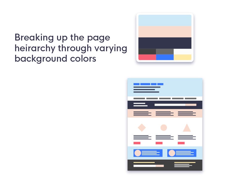
If you’ve got a lot of information, it may be difficult to keep up with everything going on in the page. To combat this, breaking the design into sections and playing off some of the different colors in your UI design can help people figure out what things they want to do with that information.
A person can further be guided to action by sticking to some conventions to relate what content the person has consumed and mapping that to a corresponding action they are now to take.
Reserving color to highlight focal points of interest
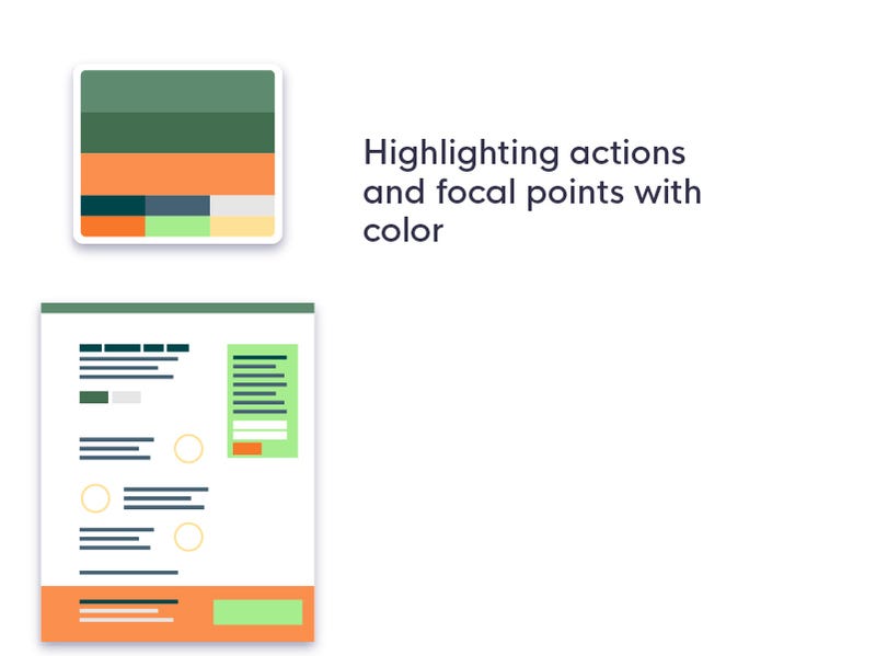
Becoming more reserved on your color choices means that you actually have more room to make a certain design pop. By only using color in places that you want the person to take action, you have a higher likelihood that the person will notice and possible take that action.
Conversion optimization plays on the principles here a lot, but that’s for another topic altogether.
Creating informational structure through the hierarchy of your main color groupings
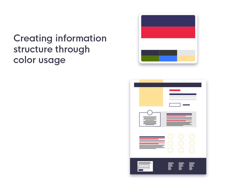
The thing to remember is that when it comes to using colors from a system you’ve defined is that you have to remain consistent. When consistency is not upheld in your application or web page, you might find that people are confused more often about what is important in the design.
People like to establish patterns, which gets us into a lot of autopilot. The easier we can make digesting information easier for us, the better. When we create a different color for every created heading like; h1, h2, h3, h4… etc, we create inconsistency to where a person won’t recognize which information is important.
The keys to color is consistency. Remain consistent in how you use color and you won’t have to deal with bad conversion or retention rates.
Take into heart that your colors will primarily be derived from the brand, but every project is a plane of new existance and may allow you to creatively and efficiently create an effective color palette that lets the rest of the creative elements on the app’s pages become more effective.
— Darian Rosebrook, Compass of Design

How do you know what skills you should focus on to get better at design?
If this is a question you need an answer to, come join other like-minded designers who are also working at becoming masters of their craft.
Every week we go over ways to market yourself better by improving your design skills, your personal brand, and other topics to further develop as a great designer.
Tap either picture to get started investing in your design skills (: